
Creating visuals that convert requires more than just a combination of colours. There are essential graphic design tips you must employ if you want to create graphics that make your audience stop in their tracks while scrolling the newsfeed.
Research already has it that people are more wired to take in visuals more than text. Recent reports on social media sharing indicate that visitors share more graphic content than text.
In this blog post, we’ll share with you our secret to creating eye-catching graphic images that prompt your audience to take action.
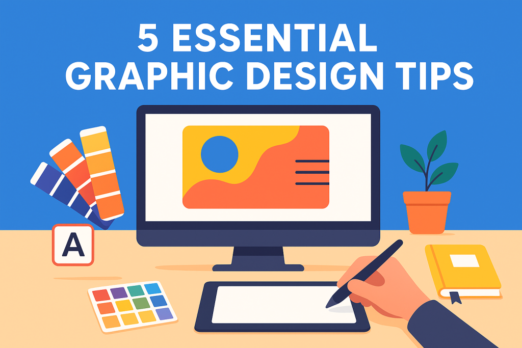
5 Essential Graphic Design tips for creating Eye-catching visuals
Table of Contents
Here are five(5) essential graphic design tips
- Start with a clear goal or visual purpose
- Choose your colors strategically
- Keep layouts clean and focused
- Prioritize typography and readability
- Maintain Visual consistency across design
Start With a Clear Visual Purpose
One of the most important graphic design tips is to begin every project with a clear visual purpose. In front of your blank canvas, even before you open a design tool, ask yourself: What is this graphic supposed to do? Is it meant to inform, persuade, entertain, or simply grab attention? Knowing your goal upfront makes all the difference.
For example, a social media post promoting a sale should immediately draw attention to the offer, while an infographic explaining a process needs to prioritize clarity and readability. Designing without a purpose can lead to cluttered, confusing graphics that don’t achieve their goal, no matter how “pretty” they look.
Another key part of defining your purpose is understanding your audience. What appeals to them visually? What will make them pause and engage? When you keep your audience in mind, every design decision, from colors to layout, becomes intentional rather than random.
Starting with a clear purpose sets the foundation for all other design choices, ensuring your graphics are not just eye-catching but also effective.
Choose Your Colors Strategically
Another key graphic design tip is to use color intentionally rather than picking shades at random. Colors aren’t just decorative; they communicate messages and guide viewers’ attention. Before choosing a color palette, think about the purpose of your graphic. For example, red can create urgency or highlight a special action, like a “Buy Now” button. Blue often conveys trust and calm, making it perfect for educational graphics or corporate visuals. Yellow and orange grab attention quickly and can add a playful or energetic vibe.
Once you know the purpose, use color strategically to create contrast, highlighting important elements, and maintaining readability.
Remember, the right color choices not only make your graphics more visually appealing but also help your audience understand the message at a glance. Thoughtful color use is one of the most effective ways to make your visuals truly eye-catching and purposeful.
Keep Layouts Clean and Focused
A cluttered graphic can quickly lose its impact, which is why one of the most practical graphic design tips is to keep your layouts clean and focused. Start by thinking about visual hierarchy: the order in which your audience sees and processes information. Your most important elements, like headlines, calls-to-action, or key visuals, should stand out immediately, while supporting details can take a back seat.
White space, or the empty areas around elements, is just as important as the content itself. It gives your design room to breathe, improves readability, and naturally guides the viewer’s eye to the key message. Avoid cramming too much text or too many images into one graphic; simplicity often creates the biggest impact.
A clean, focused layout not only makes your graphics more appealing but also reinforces the message you’re trying to communicate. When every element has a purpose, and nothing distracts from your main point, your visuals become instantly more effective and memorable.
Prioritize Typography and Readability
Typography is one of the most central elements in creating eye-catching graphics. The fonts you choose don’t just convey words; they set the tone, influence perception, and can even make or break the clarity of your message. For example, a bold, modern sans-serif might feel energetic, while a classic serif can communicate professionalism and reliability. Choosing the right font communicates intention before the viewer even reads a single word.
A key part of effective typography is font pairing. Using two complementary fonts, one for headlines and another for body text, creates contrast and keeps the design visually interesting without feeling chaotic. Avoid pairing fonts that compete for attention; they should work together to guide the viewer naturally through your message.
Spacing also matters. Pay attention to line height, letter spacing, and word spacing to make text easy to read at a glance.
By focusing on thoughtful typography choices, your graphics become more than just visually appealing; they communicate clearly, look professional, and hold the audience’s attention.
Maintain Visual Consistency Across Design
Consistency is a cornerstone of effective design and one of the most practical graphic design tips you can apply. When your colors, fonts, icons, and overall style remain consistent across graphics, you create a cohesive look that builds recognition and trust with your audience. A single disjointed graphic can make even a strong message feel unprofessional or confusing.
Consistency isn’t about making every graphic identical; it’s about repeating core elements so that your designs feel unified. For instance, using the same color palette for all social media posts, maintaining a set font style for headlines, or applying similar iconography across an infographic series strengthens your brand identity.
This approach also saves time, because once you establish a consistent style, new graphics naturally follow the same design rules without second-guessing.
Ultimately, visuals that are consistent, polished, and intentional don’t just look good; they reinforce your message, make your content memorable, and help your audience quickly identify your brand.
Click here to learn more about graphic and web design integration
Conclusion
Creating eye-catching graphics isn’t about flashy effects or complicated tools; it’s about thoughtful design choices. By starting with a clear purpose, using color strategically, prioritizing typography, keeping layouts clean, and maintaining visual consistency, you can make your visuals both attractive and effective.
Remember, strong graphics communicate your message at a glance, capture attention, and leave a lasting impression on your audience. Start applying these graphic design tips one at a time, and you’ll notice your designs not only look better but also resonate more with your audience.
On that note, if you’re looking for how to make your graphics stand out, all of these design tips we’ve mentioned, with practice and attention to detail, will help you greatly.